The way you represent the content on your website or on the company website tells almost everything about your product or whatever the website is representing. It doesn’t matter even if you have great content but if that’s not displayed in a proper way then it doesn't serve the purpose of the existing content. So, showing content in a user-friendly way is very important.
From the early days of browsers, CSS is playing a significant role in web development and we are improving ourselves along with the regular updates coming to CSS and web. It is getting simpler and more efficient to provide new experiences on web pages.
Now let's jump to the main topic, we have two CSS layout systems - Flexbox and CSS Grid. I personally prefer using both of them to unlock the full potential of CSS. In this article, we will dive in and discuss flexbox. And at the end, we will see how to use CSS Grid and flexbox together and create amazing user experiences and improve the look and feel of the web applications.
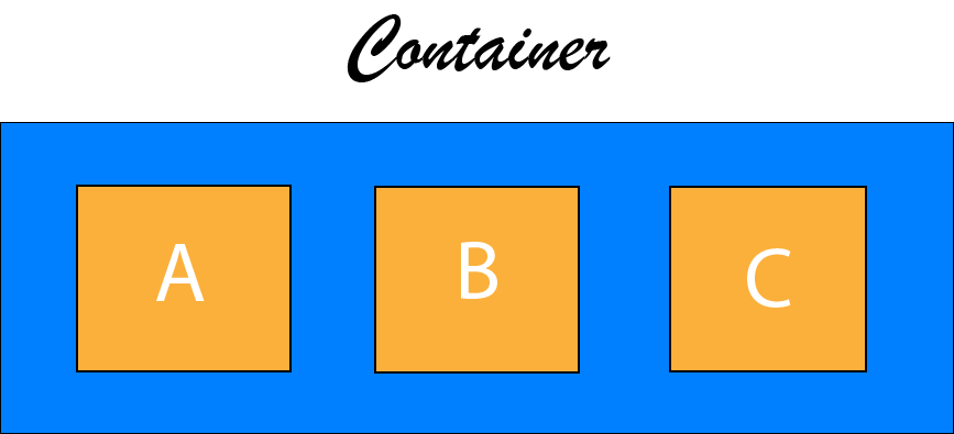
The basic thing while getting started with the flexbox is you need a flex container, which will work as a parent container in which we will be setting the basic structure of display, using Set display: flex.

.container{
display:flex; /* or inline flex */
}
Note: CSS columns have no effect on a flex container.
Flex Direction
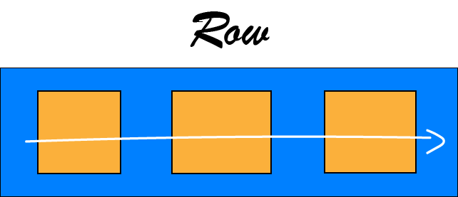
The default direction of flex is a row

change direction by flex-direction:column

.container{
 flex-direction: row | row-reverse | column | column-reverse;
}
Flex-Wrap
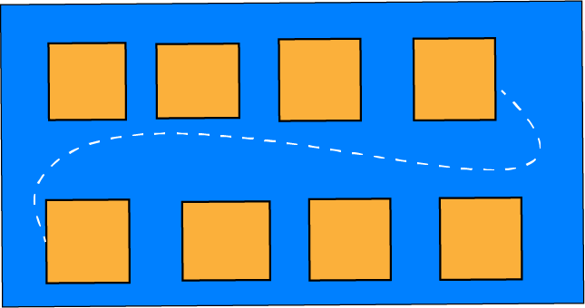
Flex items try to fix in one line but you can change that behavior.

.container {
flex-wrap: nowrap | wrap | wrap-reverse;
}
nowrap(default): All items will be on one line.wrap: Items will go on the next line from top to bottom.wrap-reverse: Items will go on the next line from bottom to top.
Justify Content
This property helps us to align objects along the main axis. It gives more control over the alignment when items overflow the line.
.container {
  justify-content: flex-start | flex-end | center | space-between | space-around | space-evenly
}
flex-start(default): Items are towards the start of the container.flex-end: Items are towards the end of the container.center: Items are center along the line.space-between: Items are evenly distributed. The first item will at the start and the last item at the end.space-around: Items get equal face around them. Note that when you look at it space is not equal. The first item will have 1unit space from the container but from the next item, it will be 2units. 1unit from itself and 1unit of the next item.space-evenly: Items are distributed in such a way that they equal space for each.
Align-Items
This is the version of justify-content along with the cross axis;
.container {
  align-items: stretch | flex-start | flex-end | center | baseline
}
stretch(default): stretch to fill the container still it follows min-width/max-width rule.flex-start: Items are placed at the start of the cross-axis.flex-end: Items are placed at the end of the cross-axis.center: Items are centered in the cross-axis.baseline: Items are aligned such as their baselines align.
Now here is one question that might pop in your head, like mine did when I first learn about it. Which is better to use CSS Grid or Flexbox?
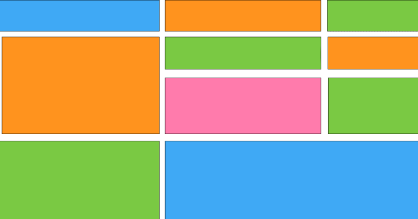
It depends if you have a small design to implement, let's say you just need to align an element in a viewport, then you can go with the flexbox. You can go with CSS Grid whenever you have complex layouts, overlapping elements to handle, and so on.
Here is a resource from scotch that will help you to visualize it better.
Conclusion
We learned about the flexbox use cases, where and how to use them effectively. I personally prefer CSS grid and flexbox. CSS grid for outer layout and for inside flexbox that’s it!
You can check the project
Thank You for reading. Signing off 🙌
Feel free to reach out 👇
GitHub: github.com/Push9828
Twitter: twitter.com/PushkarThakur28
LinkedIn: linkedin.com/in/pushkarthakur28
